Don’t confuse lighting design for still images or stage with lighting design for an architectural project. Related? Yes. Both important? Yes. Different? Yes.
Dwight Atkinson, a good architectural educator and writer about ArchiCAD-Artlantis workflows, says flat out that the only effective workflow in Artlantis is to think like a Director of Photography and light your scene accordingly. The basic technique is called three-point lighting, the three points, or lights, being
- the key light
- the fill light, and
- the back light.
So by way of a practical example see the lighting professional’s tutorial below. Videography is not our trade. Yet we share the videographer’s design sensibilities, and understand what it means to fret about foreground, background, contrast, highlighting, balance, presentation, and nuance, always, of course, with a goal of presenting subject material (in this case, a speaking person on film) as effectively as possible.
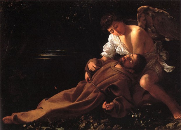
The lighting technical director at Pixar has written a book. I’m sure we should read it. But until we get around to that, an equally effective learning experience might be some quality time meditating on the image at the head of this post, painted between bar fights by Caravaggio in 1594. He was 23 years old.
It would be incorrect to say Caravaggio invented these principles of lighting, but he was certainly one of the first artists to effectively capture them, in hardcopy rising to the level of Art.
I offer the moonlight grazing the wing of the angel cradling St. Francis, and rest my case.
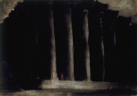
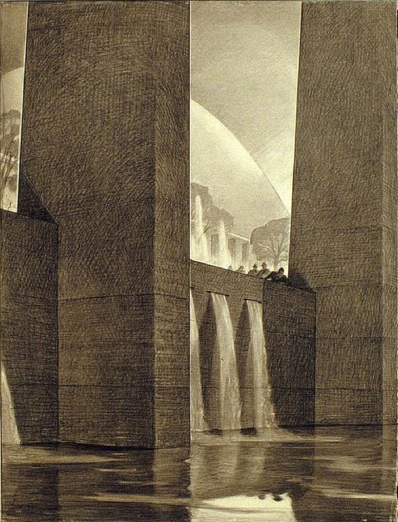
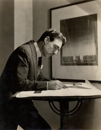
Closer to home, Hugh Ferriss‘s work also evidences a deep appreciation of foreground and background. I’m convinced he learned a thing or two from Caravaggio. Pugilistic affinities aside, you couldn’t ask for a better teacher.


