A multi-dimensional database of atmospheric carbon, tracked by season and location across time. It will be helpful to unpack the contents a bit before viewing:
- On the left is the latitude chart – reporting measured carbon in PPM for each tracking station – animated to show change over time. Blue dot = south pole. Red dot = Mauna Loa. Gray dots = others.
- On the top right, below the chart title: a key to the data sources, changing as each is incorporated into the dataset.
- Below that is a world map showing tracking station locations as each comes on-line.
- Below that, a clock with one hand for the year and the season.
- Below that, a chart reporting the south pole and Mauna Loa data, measuring carbon PPM over time.
Fascinating. Full-screen it for clarity in the details.
Teaser: there is a remarkable moment at the two-minute mark.
Climate scientists believe 350 PPM is the line above which runaway climate change is inevitable. We passed the 350 PPM mark in 1989.
What does it mean, this spectacular rise in global CO2? There are thousands of examples pointing toward a meaning, I am sure. Here is one: in the last century the temperature in western North America increased less than 2 degrees F, but as a result, beginning mostly in the last decade, the great native lodgepole pine forests in western North America are dying at an extraordinary rate. Eighty percent of British Columbia’s mature lodgepole pine trees will be lost before 2013. In Colorado over 80,000 square miles of mature lodgepole pine forest have been lost. All this with less than 2 degrees of warming. Before the predicted 3 to 8 degrees of warming by the end of this century.
The temperature is not killing the trees directly – a beetle is, now that winters are warm enough not to keep the beetles in check. What happens to the other creatures populating a complex forest ecosystem when the trees are gone? What happens when a carbon-negative forest dies and becomes a carbon-positive emitter as is currently happening in western North America?
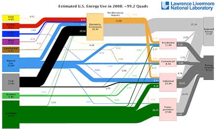
Buildings consume half of all energy produced in the United States. And therefore, at least indirectly, architects are complicit participants in the transfer of ancient carbon out of the earth and into the atmosphere. By the same token, this puts architects in a powerful position to do something about the problem. How should day-to-day practitioners of Architecture respond?
While we ponder that, time is wasting. 2010 marked the largest increase in atmospheric carbon in history – about 6% – a staggering jump by any measure, and rendering every national and international mitigation goal moot – because none of them remain within reach. Bill McKibben says we’re living on a different planet now… he may be right.
For more about the earth’s carbon cycle jump to the informative NOAA Earth System Research Laboratory CarbonTracker pages.

