A meditation on the architectural image: photograph? rendering? You decide.
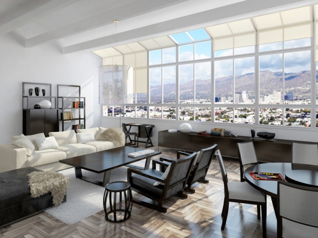
In the nineties I remember the minor kerfuffle involving an image of the interior of the not-yet-open-to-the-public MOMA in San Francisco by Mario Botta, until it was revealed that the image was not the illicit pre-grand-opening photograph captured by a ninja photographer people thought it was, but rather a digital model rendered with great care. I couldn’t find a specific link to verify my memory, but the images of SFMOMA here certainly fit the “is it real?” meme.
There are exceptions, but almost every photorealistic rendering I look at seems to lack a point other than “hey look at me and my shallow command of texture map and lighting effect.” The technology amazes, but let’s remember why Avatar was not such a good movie, and why Pixar seems incapable of making a bad one, and what architecture is for, and the reason we’ve decided to spend our lifetimes making buildings. Stealing the conceit from the Avatar link above: a CGI image is distracting like incredibly good-looking people are (the stereotypical fashion model) until you realize how vapid and self-centered and boring it is. And like incredibly good-looking people who mange to also be interesting, smart, and compassionate – CGI that *does* jump the gap between documentation and art has an uphill fight to prove its worth.
These are the same issues photography faces as an art form.
There’s a point to be made here that I’ll cite with reference to Robert Bringhurst, the typographer, poet and writer: this visual material is at its best when it self-effacingly serves the (architectural) content.
Referencing what the poet said: a rendering should be window, opening a view through to something vital.
So what’s that point again? I don’t know… perhaps it is to say that just because one can, does not mean one should. Or better: if you can, don’t forget to ask yourself why and to what effect?
Vermeer is still the gold standard.
