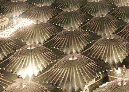
Fun with metaphors.
Three legs of a tripod: Drawings, Specifications, and the Construction Agreement, these organize the construction process of a building. Unless all three legs are there and functioning the whole operation collapses. A good tripod holds the camera steady and helps the photographer maintain focus on her intended subject.
Another: the construction phase is a symphony in concert. The conductor is the GC. The sections of the orchestra are the trades. The various musicians are the skilled subcontractors. The architect is the composer. The owner hopes the operation remains solvent.
Here’s the point: a good orchestral score requires technical proficiency. And an orchestral score, like the architect’s construction documents, needs to be well-organized, accurate, and coordinated. It needs a central idea that will move an audience. We hardly ever think of a score as a “deliverable”, but I’m sure composers fret over the quality of their deliverable as much as we do.
Back to the tripod: Our public commissions stand on three very stout versions of these three legs. Our design service agreements with public agencies, coupled with our own professional standards, obligate us to pay close attention to each of them. By contrast, our private commissions stand on stronger or weaker versions of the same three legs depending on the particular requirements of the project or the client. But keep in mind that each leg, whether feeble or stout, acknowledged or not, is always there. Whether you can trust testing it with any weight is another matter.
Another metaphor: good design is supported on a solid technical foundation. In support of this view, we reprint here with permission, Walter R. Scarborough’s recent piece from Durability+Design.
Specifying Mediocrity?
Without a Technical Foundation, Design is on Shaky Ground
The architectural profession has settled for specification mediocrity.
Allow me to explain.
My thesis is this: if the architectural profession treated the creative design process in the same way as specifications are treated, the built environment would be ugly, ugly, ugly. The profession would never abuse the creative design process in the same way they do specifications.
Specifications are supposed to be complementary to the drawings.
They ought to be the necessary technical information supporting the design intent expressed as a graphic representation of the project in the drawings.
They ought to include information that is important to the administration of the construction contract, as well as a variety of other things such as submittal requirements, performance provisions and quality requirements.
They ought to be of the same importance as the creative design process.
They ought to…
OK, you catch my drift.
The Reality
Unfortunately, the reality of specifications is nowhere near what it should be. The architectural profession has collectively decided specifications are not important and will only be provided because “something” is expected to be delivered.
Specifications have been abandoned by the profession. Many architects treat specifications flippantly and will only produce them as if an afterthought. Subcontractors and product suppliers believe well-written specifications are crucial to their financial success and essential because they directly influence the bid that is rendered for particular aspects of the work and the quality of the work to be constructed. Nevertheless, specifications are not given the same significance and level of necessity by the architectural profession.
Many firms are not hesitant to have an IT person or “BIM expert” on staff, yet at the same time they do not believe a specifier would be an asset to their work.
Think about it: an investment will be made to keep the computers running, but an investment will not be made to produce the specifications for the designs and drawings that are produced on those computers. Some firms will employ experienced specifiers on staff, but other firms will assign the responsibility for producing specifications to those individuals the leadership does not know what else to do with. Specifications occupy the lowest-value position in far too many firms.
But does the building function?
Many architects will study a design detail at great length, but will give very little time to properly specifying the products that comprise the detail being studied. The profession routinely invests time and human resources in developing the aesthetics of a project, but will ignore the technical competency necessary to get the design built. It’s more about the design than it is about delivering a properly functioning building.
Rightfully so, architects will scrutinize and seek counsel before signing a contract, but will compromise on the quality of one of the two construction documents they are obligated by that contract to deliver. Most talented and experienced specifiers will make every effort to tailor the specifications to the aesthetic design and drawings, but far too many architects are satisfied as long as something is cobbled together that can be called the specifications.
If you don’t believe this indictment, seek out the opinions and beliefs of product suppliers, the majority of whom will support the claims made in this blog space and will tell you that a lot of bad specifications are out there.
Specifications are yet another aspect of architecture that the architectural profession has neglected, the implications of which are that the constructors and product suppliers just work around them by “finishing” the documents—a position in which they do not like to be. Many product suppliers are frustrated that they are asked to bid incomplete or poorly produced documents.
Contract Documents
At the same time, the quality of drawings has declined over the last several decades, but that will be the subject of a future discussion.
Far too many architects entirely miss the point of specifications. The point is more than just the construction of the building, it’s about the following.
- The design intent and drawings are complemented with technical and administrative information.
- Procedures are established for the project delivery process.
- The roles and responsibilities are established for the administration of the contract.
- The quality of products and execution is established.
- Competition is facilitated so that the owner’s money is spent efficiently.
A risky paradigm shift
While many will disagree with these assertions, it is this commentator’s opinion that the architectural profession is in the midst of a paradigm shift toward irrelevance that has been taking place for at least a decade. Weak construction documents, the proliferation of consultants that are replacing the services of architects, the expanding role of the contractor, declining technical competency, and a profession that is focused elsewhere are converging to a point in which the architectural profession may not recover.
If the current direction continues, in a decade or so the architectural profession will be only be a small part of a bigger process that is directed, managed and administered by others, many of whom do not understand how to build buildings. The profession is moving in the direction of generalizing itself right out of existence.
When and how did it happen that specifications were determined to be unimportant and that very little effort would be put forth to produce the best possible construction documents? The architectural profession should regain a position of technical competency and ought to begin by giving specifiers and specifications the attention an owner and the construction process deserves.
About the blogger
Walter R. Scarborough, CSI, SCIP, AIA, is a contributing editor of Durability + Design, and is a registered architect and specifier with more than 30 years of technical experience with many building types. He was director of specifications for 10 of his 22 years with one of the largest architecture firms in the world.
Scarborough is revision author for CSI Project Delivery Practice Guide; co-author of the college textbook Building Construction, Principles, Materials and Systems; has written articles for periodicals; has taught college courses; has given presentations at local, state, regional, and national conferences; is active in the Construction Specifications Institute at national and chapter levels; is a past president of the Dallas CSI chapter; is a member of the Institute Education Committee; has CDT, CCS, and CCCA certifications from CSI; received CSI’s J. Norman Hunter Memorial Award in 2008; and is an ARCOM MasterSpec Architectural Review Committee member.
Comment from Robert Wagner, (10/3/2011, 10:39 AM)
Mr. Scarborough accurately describes what I have been seeing from the contractor side. I would like to add that even small improvements by architects in the coordination between drawings and specification, for example, would contribute significantly to constructibility, cost efficiencies and owner value.
Comment from John Williams, (10/3/2011, 1:12 PM)
Unfortunately, Walter is correct in many of his comments. The issue runs very deep in many firms – even those which have committed to quality specifications. The commitment has to be firm-wide and embraced by every Project Architect and Project Manager. Relegating specifications to the end of the project with extremely limited budgets is a recipe for disaster – or at least for a large number of RFI’s through the construction phase. Specifiers have to be more active in promoting themselves and the technical excellence that they can bring to the project. We are all in this together. And, we all need to promote the position of specifier to younger architects who would perhaps prefer something other than design as a career path.
Comment from Liz O’Sullivan, (10/5/2011, 3:12 PM)
Walter Scarborough’s blog hits the nail on the head regarding the declining relevance of architecture as a profession. And this situation is NOT okay. Architects need to be the people practicing architecture. But in order to continue doing that competently and effectively, architects need to be focusing more on technical building knowledge. I agree that architects as a profession are losing ground in the area of technical competency. Sometimes, it seems as if architects are trying to make up for that by relying on construction managers to fill in the technical gaps, but we’re the ones who are better suited to be doing that. We need to do our own technical research, first, and then, WE need to be the ones seeking out the advice of product reps and subcontractors. We shouldn’t hand that job over to a general contractor. Construction management delivery cannot be a replacement for lack of technical competency on the part of the architect. (We still have the professional liability for the technical aspects of those designs. If you don’t believe me, just ask the lawyers.) I fear irrelevance – not for myself – for the profession of architecture in general. I think that the AIA is barking up the wrong tree – emphasizing things like IPD and focusing on the designs of star designers instead of promoting the importance of technical competence for architects, and the importance of licensure for architects. Walter Scarborough’s blog post focuses on specs, but I see lots of drawings that are inadequate technically, too. Codes are mysterious to many architects – some don’t seem to realize that it’s their job to interpret the codes and turn them into designs, instead of putting notations on drawings that say things like “insulation thickness as required by applicable codes.” I would like to increase awareness of the importance of technical building knowledge for architects. If anyone has any tips for how to reach the people who need to hear it, let me know! I’m pretty sure I’m preaching to the choir, right here.




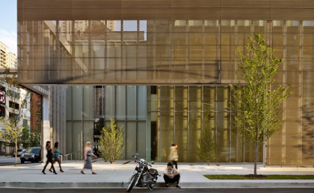
 A lot has been said about poetry and architecture, but usually that’s just a metaphor; it means architecture is like poetry in the same way as you’d say something is poetry in motion. [The Architect of the Poetry Foundation] did say that he wanted to construct this building as a kind of a parallel to a poetic experience. One thing about the building is that it’s basically glass, and you might say there are two kinds of poetry: One is stained glass, and one is clear glass. Stained glass poetry wants to be very decorative and colorful and have a brilliant surface, and the poetry I prefer is the poetry of glass, which is clear and makes you want to see through it to something vital. It’s true that as you walk through the building you get many angles from which to look at the interior of the building. So if you walk 25 or 30 feet in some direction and turn around, you are seeing an entire reconfiguration, and that is actually a quite accurate physical representation of what a poem does.
