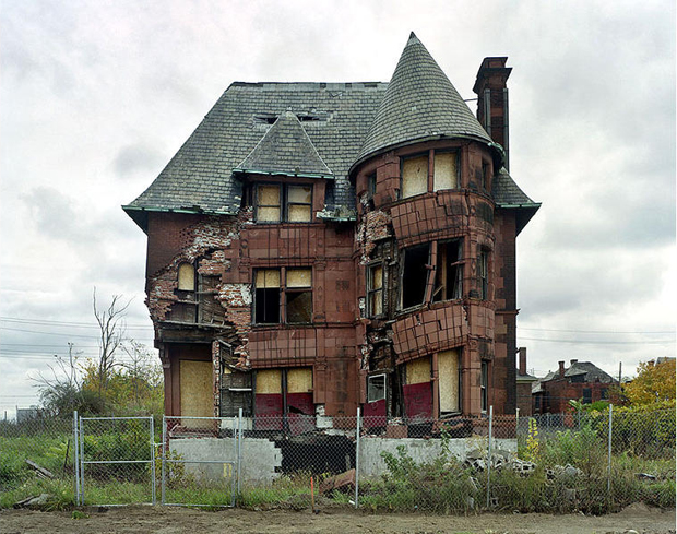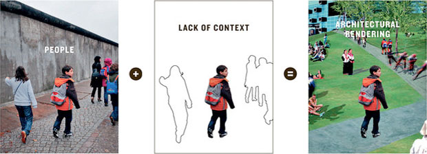
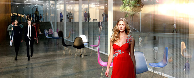


Listening to their iPods in apartments that don’t exist yet, walking their dogs down prospective city streets, playing chess together in a forthcoming park near Potrero Hill.
Who are these little humans and what are they doing in our images? The New York Times and BLGBLOG looked into the question of human figures in architect’s renderings. We’re asking ourselves the same question
George Hershey’s The Lost Meaning Of Classical Architecture paints classical architectural motifs a color grounded in unpleasant realities: Sacrifice. Blood. Enslavement. After reading that book I never thought of the Caryatids the same way again, neither the little Dwarfs holding up the front of Michael Eisner’s office; both appear reasonably content holding the building up, but if you accept George Hershey’s line of argument, they are slaves pressed into service. Michael Graves should have known better.
Technology has changed, but it seems we may have come full circle.

The ancients with incredible skill chiseled the image and likeness of humans from a block of stone and deployed the resulting figure into the service of their building.
And today it is a bit the same except we capture them from the digital ocean. It’s nice when Anderson Cooper or Angelia Jolie or underprivileged families will hang around well… forever and legitimize and tart up ones sales pitch for a project, and hopefully the pitch places it above critique, as the project is apparently already an essential part of the city.
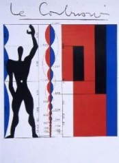 I think there was a post-classical, pre-digital phase when human figures transcended a particular time and place and stood for all humans in all places, since they didn’t sport recognizable backpacks or fashion accessories or haircuts. All are descendants of da Vinci’s Vitruvian Man, and I’m thinking of Le Corbusier’s modulor figure, or WG Clark’s beautiful ink drawings for Robert Venturi, and other mid-to-late century examples of where, in Corb’s case anyway, the figure was anonymous and functioned as a humanistic ruler to make a point about the building’s proportion or scale. These days we release our scalies into virtual architectural terrariums and hope they will be happy there.
I can’t really add much to the coverage cited above, and I encourage you to have a look at the NYT piece.
In a lighter vein (or maybe not) there’s this:




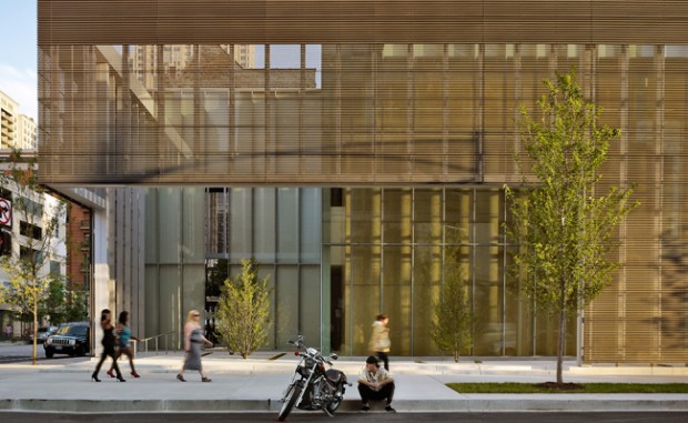
 A lot has been said about poetry and architecture, but usually that’s just a metaphor; it means architecture is like poetry in the same way as you’d say something is poetry in motion. [The Architect of the Poetry Foundation] did say that he wanted to construct this building as a kind of a parallel to a poetic experience. One thing about the building is that it’s basically glass, and you might say there are two kinds of poetry: One is stained glass, and one is clear glass. Stained glass poetry wants to be very decorative and colorful and have a brilliant surface, and the poetry I prefer is the poetry of glass, which is clear and makes you want to see through it to something vital. It’s true that as you walk through the building you get many angles from which to look at the interior of the building. So if you walk 25 or 30 feet in some direction and turn around, you are seeing an entire reconfiguration, and that is actually a quite accurate physical representation of what a poem does.