Author Jeff B

3 Sizes, 2 Kinds, 1 Modular Grid

Design aphorisms, humor, tiger mothers, and honesty don’t often travel together so I’m happy to recommend a piece by Michael Bierut based on that unlikely ensemble alone. The piece is also a memoir and tribute, of sorts, to Michael Bierut’s first boss Massimo Vignelli.

Which takes me back. Massimo Vignelli did all the graphic design for my first employer in New York, Eisenman/Robertson. The graphic ephemera of the firm designed by him, from file folders to letterhead and communication forms to the printed condoc sheets on which we drew everyday, evidenced that certain Vignelli something. Classy and professional, his work made our little eight-person office look good.

Not until years later did I discover the ground rules behind Vignelli’s work:

  1. Semantics
  2. Syntactics
  3. Pragmatics
  4. Discipline
  5. Appropriateness
  6. Ambiguity
  7. Design is One
  8. Visual Power
  9. Intellectual Elegance
  10. Timelessness
  11. Responsibility
  12. Equity

At E/R you could see Vignelli’s design rules floating up off the printed stuff, and it made an indelible impression.

Michael’s piece addresses the unwritten rules in his office and how working for someone with such a strong sense of aesthetic right and wrong affected his growth as a designer.

Jump to link.

Indulge my walk down memory lane and watch this video of my two old bosses in an interview with some C-ville shout-outs. Pure Jacque and Peter. Working at E/R was a great experience, always interesting.

Jump to link.

The Seven Keys to Best Practices for ArchiCAD

Advice from an ArchiCAD trainer.

  1. Get Organized
  2. Do it Once
  3. Save Your Settings
  4. Work From General to Specific
  5. Use ArchiCAD’s Structure
  6. Model Well, Draw Less
  7. Keep it Safe

Jump to Link

Think Long

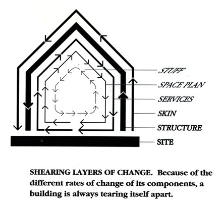
Two diagrams by Stewart Brand: both in orbit around the same idea.

The Pace Layering of Buildings

From Brand’s book How Buildings Learn.

Data Safety

We’re an office. We have stuff on hard drives. They go kaput every once in a while: count on it. Here’s the data protection overview.

Angry Birds

Glass is Air, Windows are Trees, Buildings are Sky

Every year millions of birds die by striking reflective or clear window glass in full flight.

National Geographic’s introductory video.

Building Materials Reuse

A useful link: brma.org

One-to-One Textures

Textures are typically understood to be a repeating module marching across the surface of an element. Which is why so many of them are so bad – it is not that easy to work out the edges of each texture image to seamlessly match up with itself on all sides.

Wall Cleanup Tip using Column Tool

Passing along a tip from onland.info.

Wall Typology

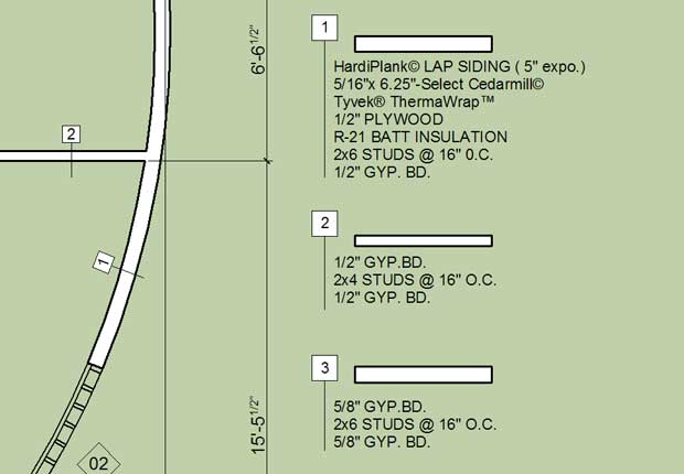
An enduring clot of inefficiency in our process involves establishing and managing schedules of partition and wall types in our construction documents. New features of the AC14 label tool might help. Discussion.

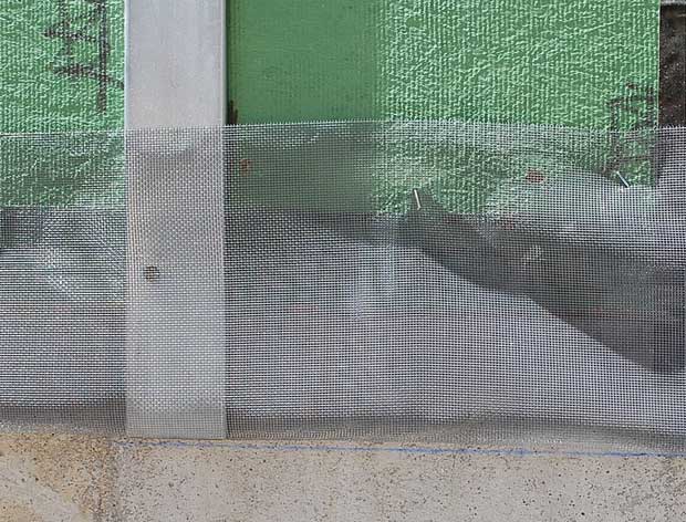
Vented Rain Screens

Water. The architect’s nemesis.