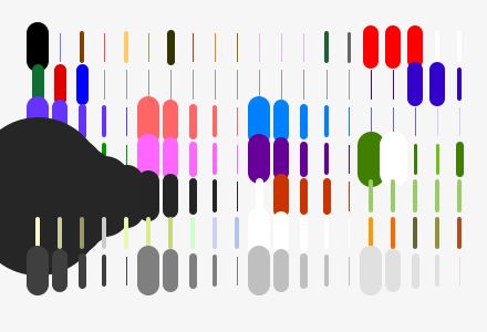
The pen set concept is a powerful one. Let’s talk about how to use pens, and pen sets, effectively.
We’ve had a really good system here at BDA since ArchiCAD 6.5. We’re way overdue for an update that works effectively in 2011 with version 15.
Quantum Mechanics
Back in the day, a drawing required a willing human, a pencil, and a sheet of paper. Or vellum. Technical drawings became elegant through conventions of line weight applied to the work through the eye and hand of the drafter, applying more or less pressure, sharpening or not sharpening the lead, and so forth.
Rapidograph technical pens came later but in discreet fixed thicknesses. The digital world is like this at the moment, and for the most part, you have to choose between specific unique thicknesses of line. Except, usually, the Rapidographs came in sets of four, or eight. By wild contrast, ArchiCAD comes with a set of… infinity! – an unlimited number of crayon boxes for your use, each box with 256 crayons. How to make sense of this unwieldy proposition? By reeling it in. After all, four Rapidographs was almost always enough.
Architectural drawing
Thickness of line is the primary medium of expression in a technical drawing, the fundamental aphorism.
In the deployment of line weight, there are only three distinctions you need to worry about:
- Aspect (surface, edge, cut)
- Distance (near, far)
- Scale
Sectional cut lines are darker than edges, which are darker than surface joints. Closer is darker than farther away. Big simple drawings use fatter lines than would small complex drawings.
Get the three Aspect pens right first, then having done that, adjust for Distance and Scale.
It’s been this way for centuries with technical drawings. The designers of Google Sketchup hard-coded the three Aspect lines into the software for good results right out of the box.
Digital modeling
SketchUp on the one hand, relatively simple and easy. On the other hand, our tools bring additional complexity and take us above and beyond the traditional surface, edge, and cut-line distinctions. Lines still govern our design lives, mostly. But there is more. While designing and documenting, we need to keep the complexity of an entire building in check and under control. We need to evidence this mastery of complexity in traditional flat-drafting distinctions, and simultaneously in real-time 3D interactions, in both color and black-and-white.
So things have gotten complicated. Layered over the foundation function of different thicknesses assigned to cut-line, edge, and surface are a myriad of systems, tags, participants, indices, and annotations. These elements and attributes are defined by the software and have little to do with the three necessary aspects of a good technical drawing. But still they must be managed. So it’s the functions we must sort out.
Here’s the takeaway:
Pens are assigned one-to-one to functions.
Pen sets sort out weight and color for media or scale.
Knowing which pens are doing what allows great control over output. Background elements are easy to render in gray, and annotations easily highlighted in red in a final print. We can lighten up the whole drawing when printed at small scale, or thicken as required for diagrammatic large-scale work.
The Pens
The default “box” or pen set for all modeling and design work is called “model”. Here’s what it looks like:
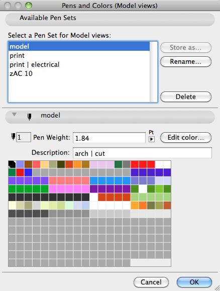
The ArchiCAD pen box has 256 slots – thirteen rows of twenty. We only use the top seven rows.
Below is an annotated illustration of the standard modeling pens. I’ll describe the architectural functions first, then follow with the ArchiCAD functions.
Architectural Functions – The First Fifteen Columns
- core – The default cut, fill, edge, and surface pens. 90% of the time you will use these four pens.
- element edges – Modeling help: important classes of architectural elements differentiated through different edge colors. The weights of the window/door frame pen is coordinated with the section cut pen so wall read correctly in plan. The rest are more or less similar weights, the important distinction is only the color.
- renov – Pens for the new renovation tags in ArchiCAD
- consultant and systems pens – In five coordinated line weights. Civil is docked the heaviest pen because pen 91 is required to be white. Oh well.
- permanent black – A full set of ten pens in coordinated weights from very thin to extremely heavy for drafting, touch-up, and annotation. “Permanent” because typically these pens would not change color for printing.
- zone colors – Nice colors for zones.
- whiteout – Coordinated weights of “permanent” white for those 3D bits or wall intersections that just won’t clean up. Also typically used to mask edges of cut fills.
- permanent gray – Four shades in five coordinated weights each.
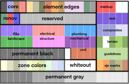
ArchiCAD Functions – The Last Five Columns
- markup – Revisions, clouds, annotations. The two white pens in the upper right are up for grabs – I hear that pen 19 is used by certain library parts as a default white so it is best left alone.
- text – Text, leaders, arrowheads, dimensions
- composite structures – Dedicated pens for interior fills patterns.
- terrain – A special heavy cut pen and white out to match, terrain fill, heavy and intermediate contour pens
- guidelines – Dedicated pens for grid lines, story lines, distant area in elevations, seo elements.
- s|e marks – Each class has it’s own color.
Pen Sets
Here are the first seven rows of the default model, print, and print electrical pen sets for comparison:
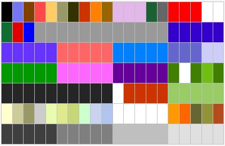
modeling colors
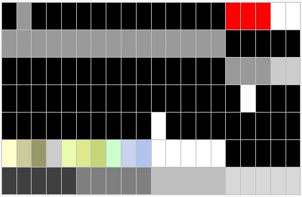
printing black except for zones, mark-up, whiteout, gray-scale
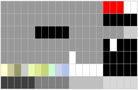
printing electrical black over a 60% gray background
Drawing Scale and Pen Weight
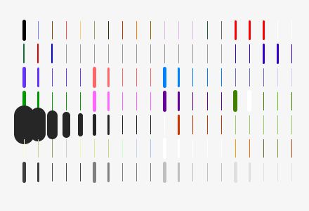
Here’s the modeling set shown at two scales, which illustrates quite nicely the problem in trying to use a single pen set for radically different scales of drawing. In our work this mostly crops up when trying to get both a useable key plan and enlarged plan out of the same model. A printing pen set optimized for printing the tiny plan will help you do this.

Transition Issues
A few projects are working nicely having been beta-testing the system. If you’re starting fresh, then great. If you’re in the middle of a project, take what seems useful from the new and evolve the old to the point it makes sense to do so. Grab the update from the template using Attribute Mover.
